

Pivot Tables Explained with Real Examples
Pivot Tables Explained with Real Examples
Pivot Tables Explained with Real Examples | Excel Pivot Table Tutorial (2026)
Learn Pivot Tables in Excel with real-world examples. Discover how to summarize, analyze, filter, and visualize data like a professional using Pivot Tables.
Pivot Tables Explained with Real Examples
If you work with large amounts of data in Microsoft Excel, Pivot Tables are one of the most powerful tools you can learn. Instead of spending hours creating formulas and manually summarizing information, Pivot Tables allow you to analyze thousands of rows of data in just a few clicks.
Whether you’re a student, accountant, HR executive, data analyst, marketer, or business owner, Pivot Tables help you uncover trends, compare performance, and make data-driven decisions quickly.
In this guide, you’ll learn what Pivot Tables are, how to create them, and how to use them with practical business examples.
What is a Pivot Table?
A Pivot Table is an Excel feature that summarizes large datasets into meaningful reports without changing the original data.
With Pivot Tables, you can:
– Calculate totals, averages, and counts
– Compare sales by region or product
– Group data by month, quarter, or year
– Filter information instantly
– Create interactive reports
– Build dashboards for business analysis
Why Should You Learn Pivot Tables?
Pivot Tables help you:
– Analyze thousands of records in seconds
– Reduce manual calculations
– Create professional reports
– Identify trends and patterns
– Support better business decisions
– Save time on repetitive reporting tasks
When Should You Use a Pivot Table?
Use Pivot Tables when you need to:
– Summarize sales data
– Analyze employee performance
– Track inventory
– Create monthly reports
– Compare departments
– Review customer purchases
– Analyze marketing campaign performance
– Prepare business dashboards
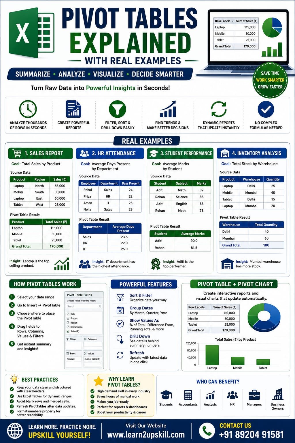
Real Example 1: Sales Report
Suppose you have this sales data:
Date| Product| Region| Salesperson| Sales (₹)
01-Jan| Laptop| North| Rahul| 55,000
02-Jan| Mobile| South| Priya| 30,000
03-Jan| Laptop| East| Aman| 60,000
04-Jan| Tablet| West| Neha| 25,000
Goal
Find:
– Total sales by product
– Total sales by region
– Top-performing salesperson
Pivot Table Setup
Rows: Product
Values: Sum of Sales
Result:
Product| Total Sales (₹)
Laptop| 115,000
Mobile| 30,000
Tablet| 25,000
Real Example 2: HR Attendance Report
Dataset:
Employee| Department| Days Present
Rahul| Sales| 24
Priya| HR| 22
Aman| IT| 25
Pivot Table
Rows:
Department
Values:
Average of Days Present
This quickly shows the average attendance for each department.
Real Example 3: Student Performance
Dataset:
Student| Subject| Marks
Aditi| Math| 92
Rohan| Science| 85
Aditi| English| 88
Create a Pivot Table with:
Rows → Student
Values → Average Marks
You’ll instantly see each student’s average score.
Real Example 4: Inventory Analysis
Dataset:
Product| Warehouse| Quantity
Laptop| Delhi| 25
Mobile| Mumbai| 40
Tablet| Delhi| 15
Pivot Table:
Rows → Warehouse
Values → Sum of Quantity
This shows total stock available at each warehouse.
How to Create a Pivot Table
Step 1
Select your data.
Step 2
Go to:
Insert → PivotTable
Step 3
Choose:
– New Worksheet
– Existing Worksheet
Step 4
Click OK.
Step 5
Drag fields into:
– Rows
– Columns
– Values
– Filters
Your Pivot Table is ready.
Understanding the Pivot Table Areas
Rows
Displays categories vertically.
Example:
– Product
– Employee
– Department
Columns
Displays categories horizontally.
Example:
– Year
– Quarter
– Region
Values
Performs calculations such as:
– Sum
– Count
– Average
– Maximum
– Minimum
Filters
Lets users filter reports without changing the source data.
Useful Pivot Table Features
Sort Data
Sort sales from highest to lowest.
Filter Data
View only a specific region, department, or product.
Group Dates
Group by:
– Month
– Quarter
– Year
Show Values As
Display:
– Percentage of Total
– Difference From
– Running Total
– Rank
Pivot Charts
You can create Pivot Charts directly from Pivot Tables.
Popular chart types include:
– Column Chart
– Bar Chart
– Line Chart
– Pie Chart
Pivot Charts update automatically whenever the Pivot Table changes, making reports more interactive.
Refreshing a Pivot Table
When your source data changes:
- Right-click inside the Pivot Table.
- Select Refresh.
Always refresh before sharing reports to ensure the latest data is included.
Best Practices
– Keep source data clean and free of blank rows.
– Use Excel Tables for dynamic data ranges.
– Give columns clear, descriptive headings.
– Avoid merged cells in source data.
– Refresh Pivot Tables after updating data.
Common Mistakes
– Not refreshing after data changes.
– Selecting incomplete data ranges.
– Using blank column headers.
– Mixing numbers and text in the same column.
– Forgetting to format values as currency, percentages, or dates where appropriate.
Advantages of Pivot Tables
– Fast reporting
– Interactive analysis
– No complex formulas required
– Easy filtering and sorting
– Excellent for dashboards
– Handles large datasets efficiently
Limitations
– Requires clean source data.
– Must be refreshed after updates.
– Very large datasets may require additional optimization or Power Pivot for advanced analysis.
Frequently Asked Questions (FAQs)
Are Pivot Tables difficult to learn?
No. Once you understand the Rows, Columns, Values, and Filters areas, creating Pivot Tables becomes straightforward.
Do Pivot Tables update automatically?
Not always. You generally need to refresh the Pivot Table after changing the source data.
Can beginners use Pivot Tables?
Yes. They’re one of the best Excel features for beginners because they simplify data analysis without requiring complex formulas.
Are Pivot Tables useful in jobs?
Absolutely. Pivot Tables are widely used in finance, accounting, HR, sales, operations, marketing, and data analysis, making them a valuable workplace skill.
Final Thoughts
Pivot Tables are one of the most powerful features in Microsoft Excel. They allow you to turn large, complex datasets into clear, actionable reports with just a few clicks.
Whether you’re preparing monthly sales reports, tracking inventory, analyzing employee performance, or building interactive dashboards, Pivot Tables can save time and improve decision-making.
Learning Pivot Tables is a valuable investment for students, professionals, and business owners who want to work more efficiently with data.
At Learn2Upskill, we’re committed to helping you build practical Excel skills that support your career growth.
Visit: www.learn2upskill.com
Contact Us: +91 89204 91581
Learn Smarter. Practice More. Upskill Every Day.
You May Also Like
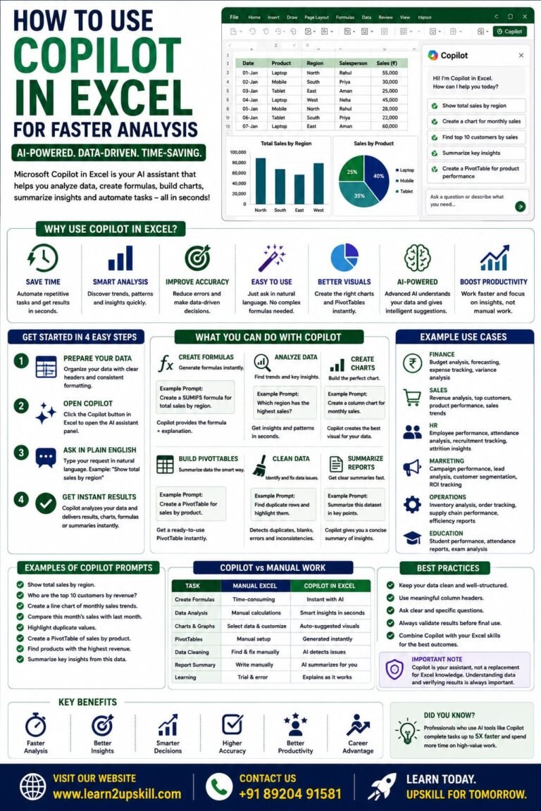
How to Use Copilot in Excel for Faster Analysis Learn how to use Microsoft Copilot in Excel to analyze data...
-
-
July 21, 2026
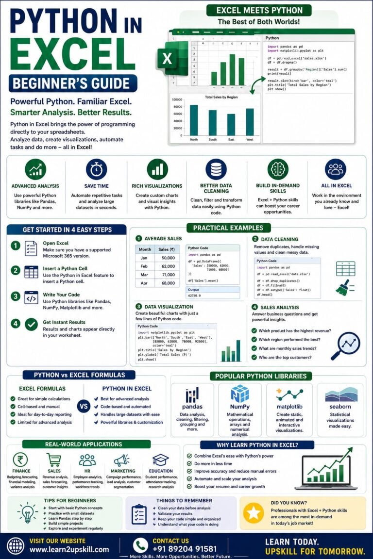
Python in Excel Learn how to use Python in Microsoft Excel with this beginner-friendly guide. Discover setup, syntax, examples, benefits,...
-
-
July 20, 2026
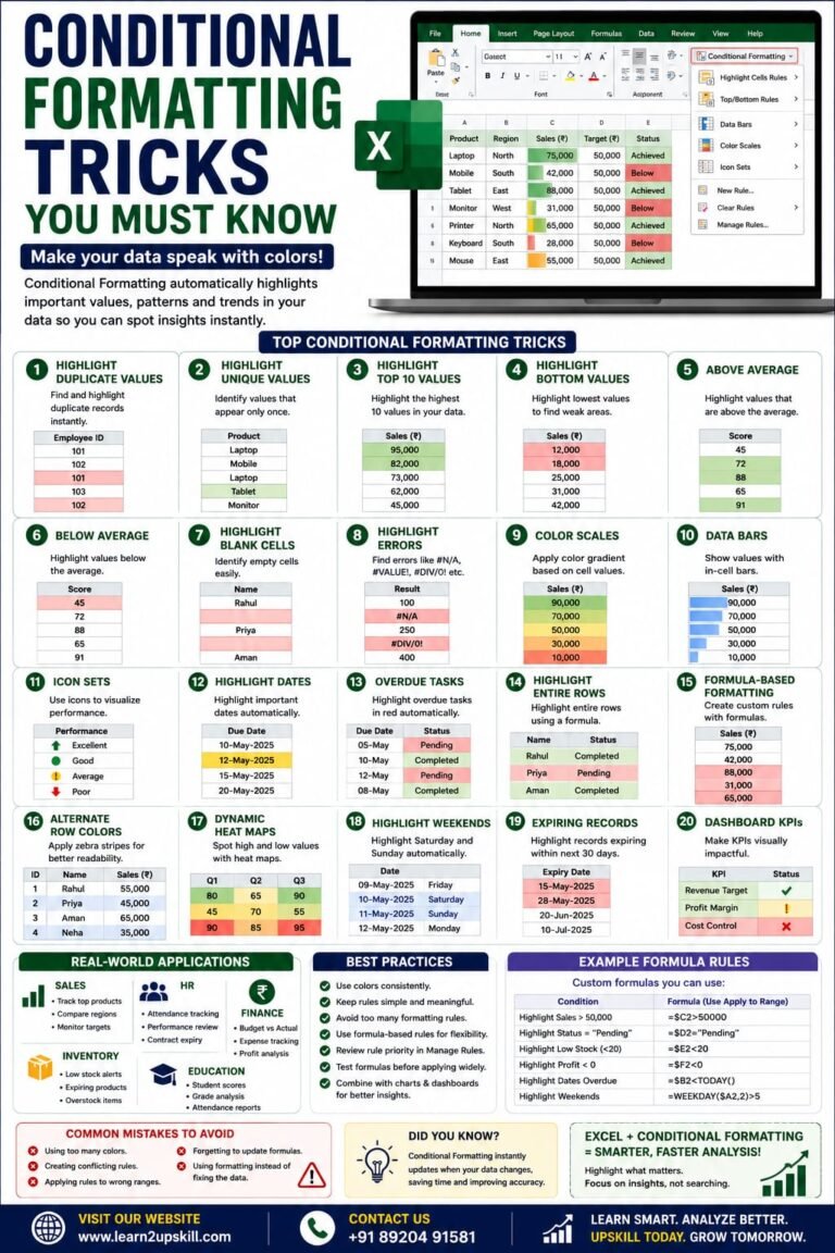
Conditional Formatting Tricks You Must Know) Learn the best Conditional Formatting tricks in Excel with practical examples. Highlight duplicates, overdue...
-
-
June 12, 2026