

Which Chart Should You Use?
Which Chart Should You Use?
Learn the best Excel charts for data visualization. Discover when to use column, bar, line, pie, scatter, area, combo, and other charts with real-world examples.
Focus Keyword: Excel Charts
Excel Charts: Which Chart Should You Use?
Charts are one of the most powerful features in Microsoft Excel. They transform rows of numbers into easy-to-understand visuals, helping you identify trends, compare data, and communicate insights effectively.
However, choosing the wrong chart can make your data confusing instead of informative. The key to creating professional reports is selecting the chart type that best fits your data and your message.
In this guide, you’ll learn the most popular Excel charts, when to use them, and practical examples to help you create better reports and dashboards.
Why Are Excel Charts Important?
Excel charts help you:
– Visualize large datasets
– Identify trends and patterns
– Compare categories
– Present data professionally
– Support business decisions
– Improve dashboards and reports
Whether you’re a student, accountant, HR executive, marketer, business owner, or data analyst, understanding Excel charts is an essential skill.
Types of Excel Charts
Microsoft Excel offers many chart types, but these are the ones professionals use most often.
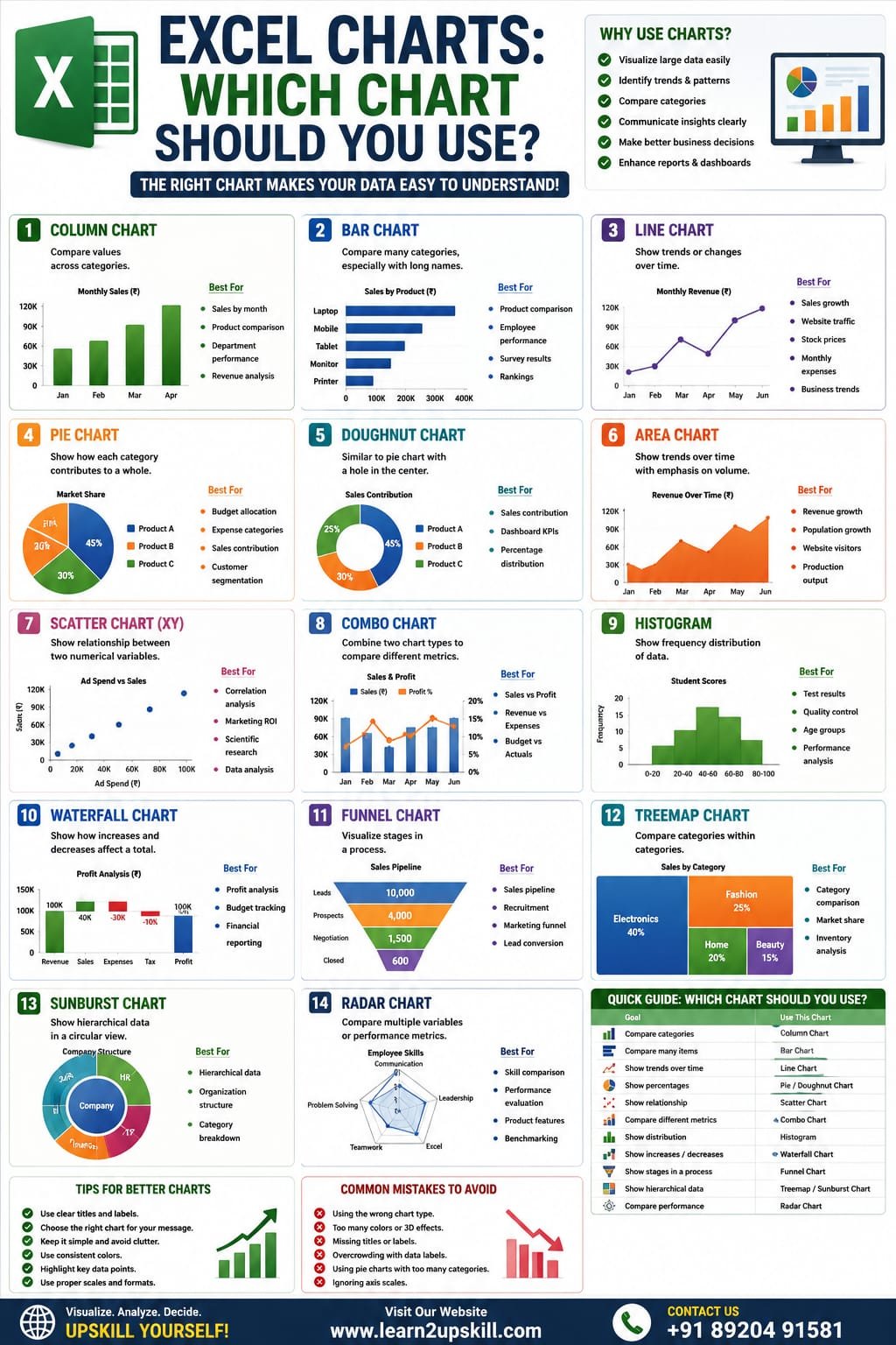
- Column Chart
Best For
Comparing values across categories.
Example
Monthly Sales
Month| Sales (₹)
Jan| 80,000
Feb| 95,000
Mar| 110,000
Real-World Uses
– Monthly sales
– Department performance
– Product comparison
– Revenue analysis
Why use it?
Column charts make it easy to compare values side by side.
- Bar Chart
Best For
Comparing many categories, especially when category names are long.
Example
Sales by Product
– Laptop
– Mobile
– Tablet
– Monitor
– Printer
Real-World Uses
– Product comparisons
– Employee performance
– Survey results
– Customer rankings
- Line Chart
Best For
Showing trends over time.
Example
Monthly Revenue
January → December
Real-World Uses
– Sales growth
– Website traffic
– Stock prices
– Monthly expenses
– Business performance
Tip: Use a line chart whenever you want to show change over time.
- Pie Chart
Best For
Showing how each category contributes to a whole.
Example
Market Share
– Product A – 45%
– Product B – 30%
– Product C – 25%
Real-World Uses
– Budget allocation
– Expense categories
– Sales contribution
– Customer segmentation
Best Practice: Limit pie charts to a small number of categories for easier reading.
- Doughnut Chart
A Doughnut Chart is similar to a Pie Chart but has a hole in the center.
Best For
– Sales contribution
– Business dashboards
– Percentage distribution
- Area Chart
Best For
Showing trends while emphasizing volume over time.
Real-World Uses
– Revenue growth
– Population growth
– Website visitors
– Production output
- Scatter Chart (XY)
Best For
Showing relationships between two numerical variables.
Example
Advertising Spend vs Sales
Real-World Uses
– Data analysis
– Scientific research
– Marketing ROI
– Correlation studies
- Combo Chart
A Combo Chart combines two chart types, such as a column chart with a line chart.
Best For
Comparing different metrics with different scales.
Example
Columns = Monthly Sales
Line = Profit Margin (%)
Real-World Uses
– Sales vs Profit
– Revenue vs Expenses
– Budget vs Actual Performance
- Histogram
Best For
Understanding the distribution of data.
Example
Student exam scores
Real-World Uses
– Quality control
– Test results
– Customer age groups
– Performance analysis
- Waterfall Chart
Best For
Showing how increases and decreases affect a final total.
Real-World Uses
– Profit analysis
– Budget tracking
– Financial reporting
- Funnel Chart
Best For
Visualizing stages in a process.
Real-World Uses
– Sales pipeline
– Recruitment process
– Marketing funnel
– Lead conversion
- Treemap Chart
Best For
Comparing categories within categories.
Example
Company Departments
→ Sales
→ HR
→ IT
Each department can contain smaller categories.
- Sunburst Chart
Best For
Showing hierarchical data.
Examples include:
– Product Categories
– Organization Structure
– Family Trees
- Radar Chart
Best For
Comparing multiple performance metrics.
Example
Employee Skills
– Communication
– Leadership
– Excel
– Teamwork
– Problem Solving
Which Chart Should You Use?
Goal| Recommended Chart
Compare categories| Column Chart
Compare many items| Bar Chart
Show trends| Line Chart
Show percentages| Pie Chart
Show contribution| Doughnut Chart
Compare two variables| Scatter Chart
Compare two metrics| Combo Chart
Analyze distribution| Histogram
Show increases & decreases| Waterfall Chart
Sales pipeline| Funnel Chart
Hierarchical data| Treemap / Sunburst
Compare performance| Radar Chart
Tips for Creating Better Excel Charts
– Give every chart a clear title.
– Label axes when necessary.
– Keep colors consistent.
– Avoid unnecessary 3D effects.
– Choose the simplest chart that communicates the message clearly.
– Highlight important data points without cluttering the chart.
Common Mistakes
– Choosing the wrong chart type.
– Using too many colors.
– Overcrowding charts with labels.
– Ignoring axis titles.
– Making charts too small to read.
– Adding unnecessary decorative effects.
How Charts Improve Dashboards
Charts are the heart of Excel dashboards because they:
– Make reports interactive.
– Display KPIs visually.
– Highlight trends.
– Help management make faster decisions.
– Simplify complex datasets.
Popular dashboard charts include:
– Column Charts
– Line Charts
– Bar Charts
– Doughnut Charts
– Combo Charts
Final Thoughts
Choosing the right chart is just as important as having accurate data. The right visualization helps your audience understand information quickly, while the wrong one can create confusion.
As you build your Excel skills, practice using different chart types with real datasets. You’ll become more confident in creating reports, dashboards, and presentations that communicate insights effectively.
At Learn2Upskill, we’re committed to helping students and professionals master Excel through practical tutorials, real-world examples, and career-focused learning.
Visit: www.learn2upskill.com
Contact Us: +91 89204 91581
Learn Better. Visualize Smarter. Grow Faster.
You May Also Like
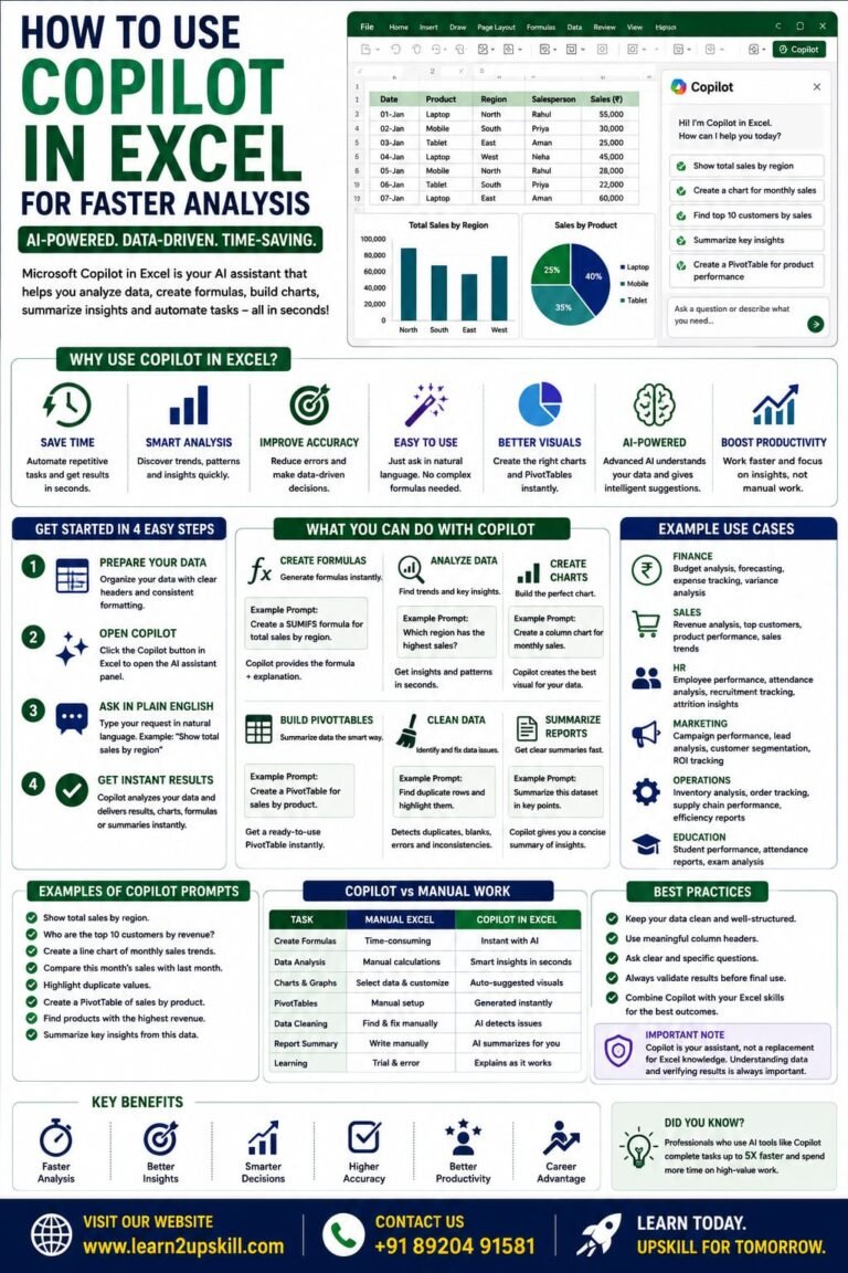
How to Use Copilot in Excel for Faster Analysis Learn how to use Microsoft Copilot in Excel to analyze data...
-
-
July 21, 2026
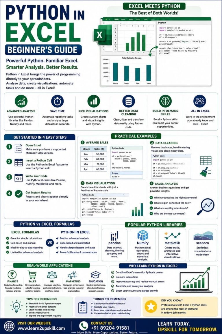
Python in Excel Learn how to use Python in Microsoft Excel with this beginner-friendly guide. Discover setup, syntax, examples, benefits,...
-
-
July 20, 2026
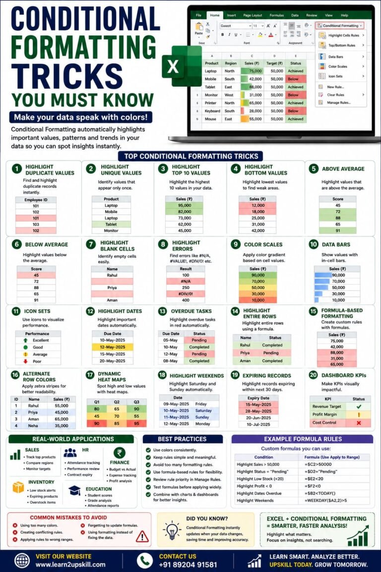
Conditional Formatting Tricks You Must Know) Learn the best Conditional Formatting tricks in Excel with practical examples. Highlight duplicates, overdue...
-
-
June 12, 2026