

How to Create a Dashboard in Excel
How to Create a Dashboard in Excel
Learn how to create a professional Excel dashboard with charts, Pivot Tables, slicers, KPIs, and interactive reports. Step-by-step tutorial with practical examples.
How to Create a Dashboard in Excel
In today’s data-driven world, businesses generate thousands of rows of data every day. Simply storing data isn’t enough—you need a way to analyze, monitor, and present information clearly. That’s where Excel Dashboards come in.
An Excel dashboard combines charts, Pivot Tables, KPIs (Key Performance Indicators), and interactive filters into a single, easy-to-read report. Instead of scrolling through endless spreadsheets, users can quickly understand business performance and make informed decisions.
Whether you’re a student, accountant, HR executive, sales manager, business owner, or data analyst, learning how to build Excel dashboards is a valuable career skill.
In this guide, you’ll learn everything you need to create a professional Excel dashboard from scratch.
What Is an Excel Dashboard?
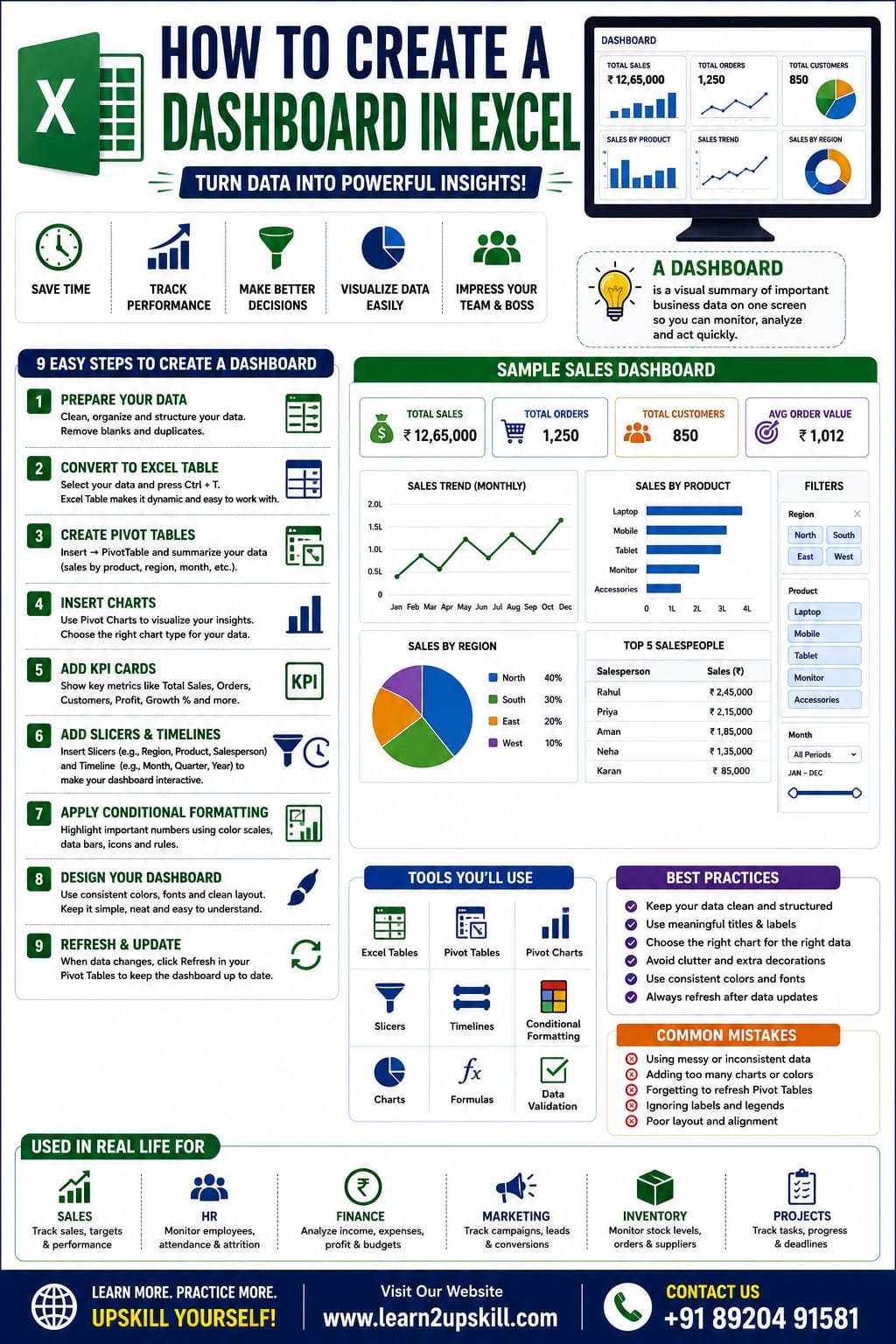
An Excel Dashboard is a visual summary of important business data displayed on one worksheet. It brings together charts, tables, KPIs, and filters so you can monitor performance at a glance.
A well-designed dashboard helps answer questions such as:
– What are our total sales this month?
– Which region is performing best?
– Which products generate the highest revenue?
– Are we meeting our targets?
– What trends are visible over time?
Why Use an Excel Dashboard?
Excel dashboards help you:
– Visualize large amounts of data
– Track KPIs in real time (after data refresh)
– Save reporting time
– Make better business decisions
– Present data professionally
– Share insights with teams and management
Real-World Uses of Excel Dashboards
Sales Dashboard
Track revenue, top-selling products, sales by region, and monthly growth.
HR Dashboard
Monitor attendance, employee count, recruitment, and attrition.
Finance Dashboard
Analyze income, expenses, profit, cash flow, and budgets.
Marketing Dashboard
Measure campaign performance, website traffic, leads, and conversions.
Inventory Dashboard
Track stock levels, reorder status, supplier performance, and inventory value.
Tools You’ll Use
Most Excel dashboards are built using these features:
– Excel Tables
– Pivot Tables
– Pivot Charts
– Slicers
– Timelines
– Conditional Formatting
– Charts
– Data Validation
– Formulas (SUMIFS, XLOOKUP, INDEX, MATCH, IF, etc.)
Step 1: Prepare Your Data
Before building a dashboard, organize your data properly.
Example:
Date| Product| Region| Salesperson| Sales (₹)
01-Jan| Laptop| North| Rahul| 55,000
02-Jan| Mobile| South| Priya| 30,000
03-Jan| Tablet| East| Aman| 25,000
Best practices:
– One header row
– No blank rows
– Consistent formatting
– Dates stored as dates
– Numbers stored as numbers
Step 2: Convert Data into an Excel Table
- Select the dataset.
- Press Ctrl + T.
- Check My table has headers.
- Click OK.
Benefits:
– Dynamic ranges
– Easier formulas
– Automatic expansion
– Better Pivot Tables
Step 3: Create Pivot Tables
Go to:
Insert → PivotTable
Create Pivot Tables for:
– Sales by Product
– Sales by Region
– Monthly Sales
– Salesperson Performance
These Pivot Tables will become the foundation of your dashboard
Step 4: Create Charts
Turn your Pivot Tables into visual reports.
Recommended chart types:
– Column Chart for product comparisons
– Line Chart for monthly trends
– Bar Chart for regional performance
– Pie or Doughnut Chart for category shares (use sparingly)
– Combo Chart for comparing multiple metrics
Choose chart types that make the data easy to understand.
Step 5: Add KPI Cards
Display important metrics such as:
– Total Sales
– Total Orders
– Average Order Value
– Best-Selling Product
– Total Customers
Format KPI cards with bold numbers and clear labels so users can understand the dashboard at a glance.
Step 6: Add Slicers
Slicers make dashboards interactive.
Go to:
PivotTable Analyze → Insert Slicer
You can add slicers for:
– Region
– Product
– Salesperson
– Department
When users click a slicer, all connected Pivot Tables and Pivot Charts update automatically.
Step 7: Add a Timeline
If your data includes dates:
Go to:
Insert Timeline
Users can filter data by:
– Month
– Quarter
– Year
This makes it easy to analyze performance over different time periods.
Step 8: Apply Conditional Formatting
Use conditional formatting to highlight:
– Top-performing products
– Sales above target
– Low inventory
– Negative profit
– Overdue tasks
Examples include color scales, data bars, and icon sets.
Step 9: Design Your Dashboard
A professional dashboard should:
– Use a consistent color palette
– Include clear titles
– Align charts neatly
– Leave enough white space
– Avoid unnecessary visual clutter
Keep the design clean and focused on insights rather than decoration.
Sample Dashboard Layout
Top Section
– Company Name
– Dashboard Title
– Date Filter
Middle Section
– KPI Cards
– Sales Trend Chart
– Product Performance Chart
Bottom Section
– Regional Sales
– Top Customers
– Monthly Comparison
– Interactive Filters
Tips for Better Dashboards
– Keep everything on one screen when possible.
– Limit the number of colors.
– Use meaningful chart titles.
– Avoid 3D charts that can distort data.
– Test filters to ensure everything updates correctly.
Common Mistakes to Avoid
– Using messy source data.
– Adding too many charts.
– Ignoring labels and legends.
– Forgetting to refresh Pivot Tables after data changes.
– Mixing different date formats or inconsistent values.
Who Should Learn Excel Dashboards?
Excel dashboards are useful for:
– Students
– Accountants
– Data Analysts
– HR Professionals
– Financial Analysts
– Sales Managers
– Business Owners
– Project Managers
– MIS Executives
– Operations Teams
Final Thoughts
Creating an Excel dashboard is one of the most valuable skills you can learn for reporting and data analysis. Dashboards help transform raw data into meaningful insights, making it easier to monitor performance, identify trends, and support better decisions.
By combining Excel Tables, Pivot Tables, charts, slicers, timelines, and conditional formatting, you can build interactive dashboards that impress employers and improve productivity.
At Learn2Upskill, we believe practical Excel skills open doors to better career opportunities. Keep practicing with real datasets, experiment with different dashboard layouts, and continue building your expertise.
Visit: www.learn2upskill.com
Contact Us: +91 89204 91581
Learn. Analyze. Visualize. Upskill.
You May Also Like
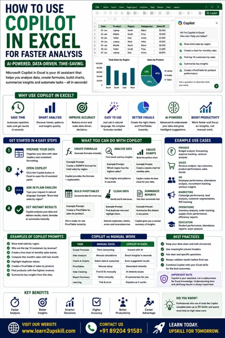
How to Use Copilot in Excel for Faster Analysis Learn how to use Microsoft Copilot in Excel to analyze data...
-
-
July 21, 2026
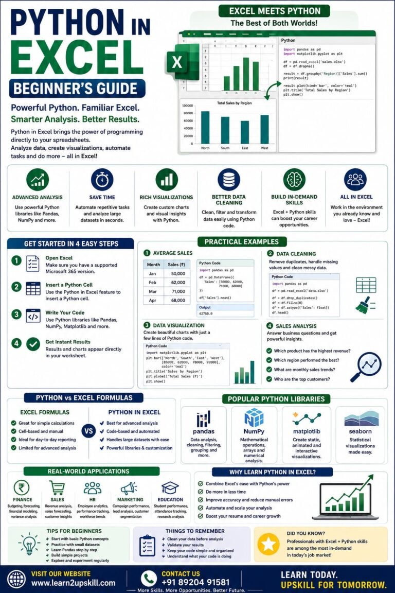
Python in Excel Learn how to use Python in Microsoft Excel with this beginner-friendly guide. Discover setup, syntax, examples, benefits,...
-
-
July 20, 2026
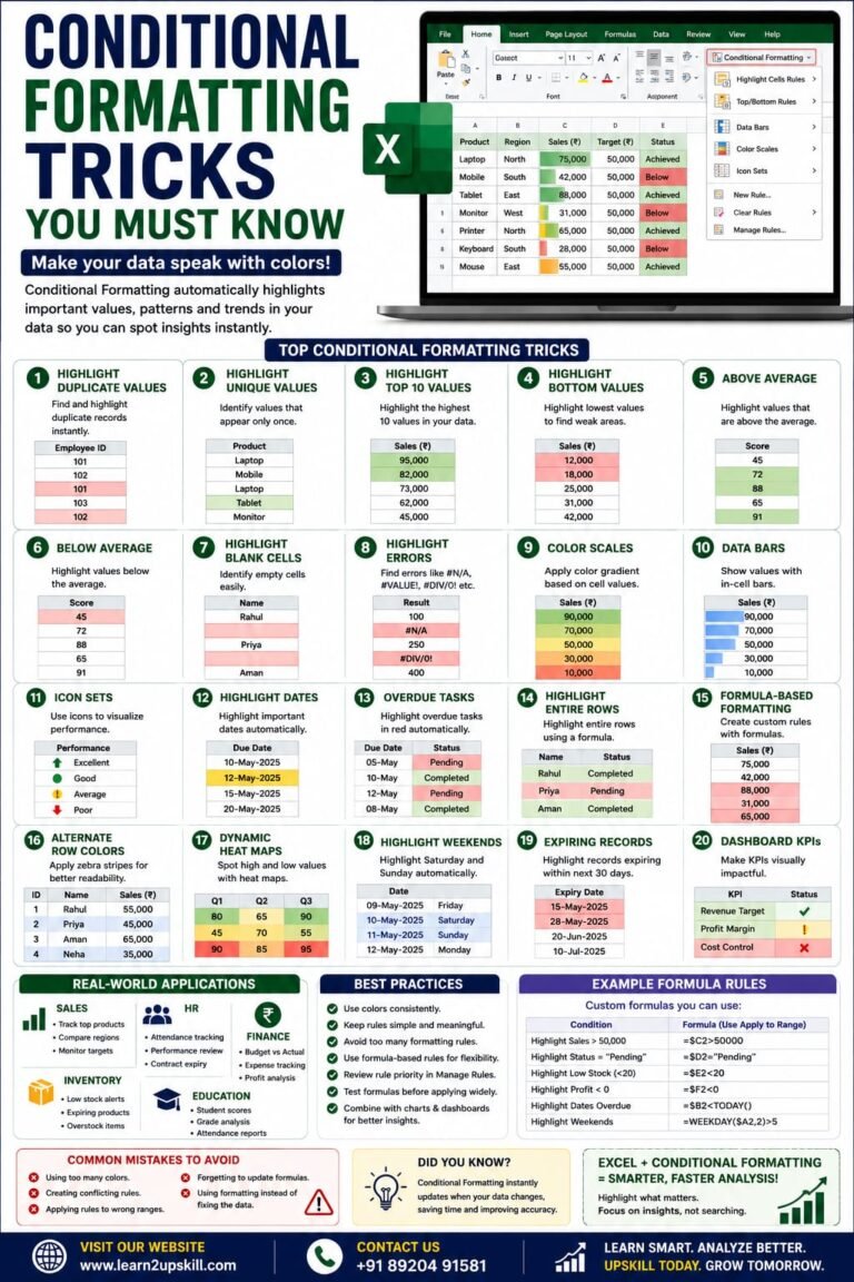
Conditional Formatting Tricks You Must Know) Learn the best Conditional Formatting tricks in Excel with practical examples. Highlight duplicates, overdue...
-
-
June 12, 2026